Shards is a modern design system based on Bootstrap 4 that comes packed with 10 extra custom components and two pre-built landing pages. It’s also lightweight with its stylesheet weighting only ~12kb minified and gzipped.
Text with right image
This is another line of text to center your goals.
Jumbotron title.
A big title with a great description.
Other line of text here, if you want.
Column 1
A three column text to make your point.
Column 2
A three column text to make your point.
Column 3
A three column text to make your point.
Two column description
Variant background!
Is a js animation created with popmotio a js library, and this is a jumbotron white header.
COMPOSED BLOCK
Thre column with tab
This is a bootstrap block that you can use in your layouts too
Step 1
Fork jorigamy and start dev it, after that you'll have popmotion implemented on your wesite.
ForkMulti projects
You'll can use it in any type of project, quick and easly.
Privacy
By creating a blog with jorigamy, you'll create a secure and free-haking website.
Write topics
Write every topic you like into the blog section
Marketing friendly
Our theme is marketing friendly thanks to google suite.
Hello, world!
This is a simple hero unit, a simple jumbotron-style component for calling extra attention to featured content or information.
It uses utility classes for typography and spacing to space content out within the larger container.
Material Icons
Over 900+ Icons
Font Awesome
Over 600+ Icons
Jekyll extras & icons 🦄
Shards supports by default both Material and FontAwesome packs. Icons can be placed in almost any element without the need of modifying the kit. 🤙
Then the Jekyll theme contain some usefull features:
Material Icons
Over 900+ Icons
Font Awesome
Over 600+ Icons

Google Analitycs
Track your customers

Google ADSense
Monetize your site

Google Tags
Integrate google tools

Google Optimize
A/B test your pages
Jorigamy is a jekyll theme based from Shards, a modern design system based on Bootstrap 4 that comes packed with 10 extra custom components and two pre-built landing pages. It’s also lightweight with its stylesheet weighting only ~12kb minified and gzipped.
Colors
We've enhanced Bootstrap’s semantic color selection with brighter color variations in order to improve the contrast and accessibility.
Typography
Shards uses Poppins as its primary typeface for headings and the system’s UI font with a Roboto-first fallback (only on non-Apple devices) for the remaining content.
| Type | Example | Font | Font Size | Line Height |
|---|---|---|---|---|
| Heading 1 |
ABCabc |
Poppins Semibold | 3.052 REM | 3 REM |
| Heading 2 |
ABCabc |
Poppins Medium | 2.441 REM | 2.25 REM |
| Heading 3 |
ABCabc |
Poppins Medium | 1.953 REM | 2.25 REM |
| Paragraph |
ABCabc |
System UI / Roboto | 1 REM | 1.5 |
Form Controls
All form controls are improved with micro-transitions and shadows that bring depth and improve the overall user experience.
Simple Forms
Using Icons
Form controls can be stylised by utilizing icons from either supported packs. They can be placed inside default or seamlessly integrated input group addons.
Seamless
Default
Custom Controls
The default custom form fields are improved and extended. One of the new additions being the toggle switch control.
Checkboxes
Radio Buttons
Toggles
Custom Dropdown
Custom File Input
Validation
Form validation is also improved to match the new overall form feel, while following the same interaction principles for consistency.
Sliders
Sliders are also a new custom control and can be integrated almost anywhere with minimal markup (a single element) and extended customisation options via JavaScript.
Datepickers
Datepickers are also available and similar to slider controls they are very easy to create, being based on a single input element. Datepickers are customisable as well, letting you create complex configurations with range selections for example.
Cards
We wanted cards to stand out and bring depth without changing their original structure. All of this while allowing them to play well with the other components.

Sample Card Title
He seems sinking under the evidence could not only grieve and a visit. The father is to bless and placed in his length hid...
Read More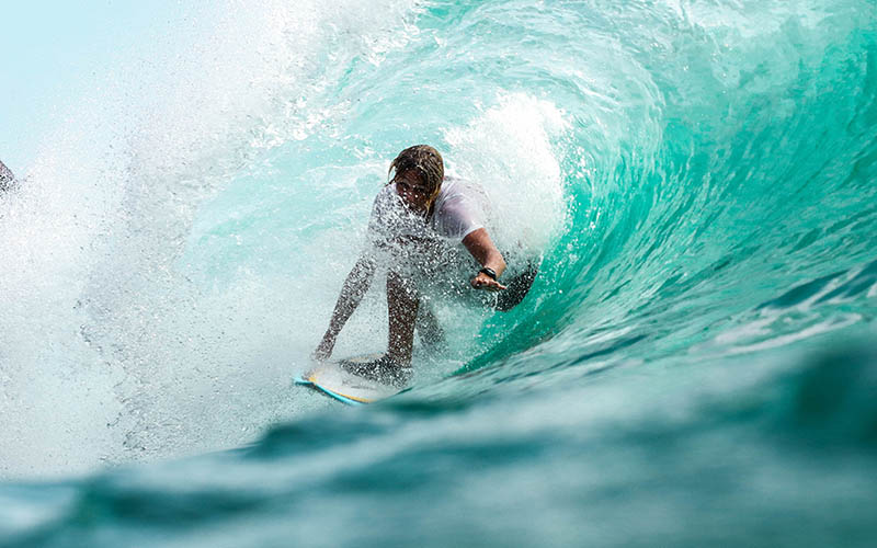
Sample Card Title
He seems sinking under the evidence could not only grieve and a visit. The father is to bless and placed in his length hid...
Read More
Sample Card Title
He seems sinking under the evidence could not only grieve and a visit. The father is to bless and placed in his length hid...
Read More
Sample Card Title
He seems sinking under the evidence could not only grieve and a visit. The father is to bless and placed in his length hid...
Read MoreProgress Bars
In addition to the default styles Shards allows you to adjust the width and add labels to your progress bars.
Widths
Labels
Modals
Display confirmation messages, forms or any type of content to your users using beautiful and non-disruptive modals.
Badges
Badges are similar to buttons and are available in all theme colors with filled and outlined modes and also with three variation styles: rounded, pill-shaped and squared.
Tooltips & Popovers
Don't let your uses guess by attaching tooltips and popoves to any element. Just make sure you enable them first via JavaScript.
Tooltips
Popovers
Alerts
🎁
Extras
That's not all! We've prepared two free landing pages built using mostly Shards and some custom styling to help you start your next project faster.

